
.webp)
Rebrand Ideas: Don’t Make the Same Mistake as Most Brands
Many people hear the word rebrand, and think of a shiny new logo. How it will look splashed across social media, or on tote bags spotted at the gym.
But really, a logo is the last thing you should change. By the time you're choosing fonts and a colour palette, your identity should already be established. If it isn't, all you’re doing is pushing out a redecoration with a press release.
This post is about rebranding properly. Whether you're a founder, an SME marketer, or a small business, you'll find rebrand ideas here that go a lot deeper than a new shade of pink. We'll have a look at real rebranding examples, cover when and how to rebrand, and walk you through the launch moves that are often ignored, but always important.
So what is a rebrand, really?
Quick definition first, because rebrand has become another buzzword.
A rebrand is a fundamental change in your brand identity: how your brand shows up, what it stands for, who it's for, and how it sounds and looks. A brand refresh is lighter. You modernise the visual identity, tidy the brand guidelines, maybe do a new logo, but the core stays put. A partial rebrand sits in the middle: perhaps a new name with the same values, or a new look with the same positioning.
We are visual creatures after all, so it’s no surprise that the visible brand elements are the bits everyone pictures. A new logo, colour palette, typography, packaging, signage, a website redesign, sometimes a new domain. The rebrand cost and rebrand timeline scale with how much of that you touch. A partial rebrand is quicker and cheaper than building an entirely new identity from scratch.
Knowing which one you actually need keeps you on the good side of whoever runs your finances. Plenty of companies announce a full rebrand when a refresh would have done the job. A few do the opposite; painting over a problem that needed demolishing.
Signs you need to rebrand (and signs you don't)
You should be looking at a rebrand if:
- Your positioning no longer matches who you've become, and you need a significant shift.
- You're targeting a modern audience or a brand new market.
- A merger or acquisition has left you with two brands and one story.
- A name change is genuinely necessary, for legal reasons, expansion, or because the name is holding you back. A name change usually means a new domain too.
- Your brand perception has drifted somewhere you don't want it.
- You still look like the scrappy startup you were five years ago, and it's costing you credibility.
If your strategy is sound and the audience hasn't changed, but the visuals are tired and want a new vibe, then you’re looking at a refresh. Whatever you do, do not rebrand out of boredom. We all want to burn everything to the ground every now and again, but your brand is not the place to do that without legitimate reasons.
Rebrand ideas that start with strategy
If you’re starting your rebrand planning with the logo or colour palette, you’re already off on the wrong foot. You need to start with your target audience and real market research. Competitor analysis, customer feedback, and data enable you to nail your brand and market positioning, establish your USPs and be clear on who you’re not for.
A strong rebranding strategy follows a strategic process in this order; your brand strategy first and the look of it last. Then the brand story, the mission statement, the brand values, the tagline and the brand voice. Finally the creative direction and the visual identity will bring it all to life. If you're testing out rebranding name ideas, the same rule applies. Don’t pick a name just because you like the sound of it, it has to come from your positioning.
If you get the strategy right, the creative side comes easily, but get it wrong and no font in the world will save you. This is why handing the whole thing to a design agency before the strategy is settled tends to end in expensive disappointment.
If you want to see brand voice done well before you rebuild your own, we broke down thirteen brands that get it right. Read it here: Brand tone of voice examples: 13 brands that nail it (and what you can steal from each).
Why rebranding is your sharpest lever in the AI age
Rebranding and repositioning are the most powerful strategic levers you have right now because of AI. For years, consistency was gospel; show up the same everywhere, repeat the message, build awareness through repetition. And while it still matters, it’s no longer the biggest lever you've got.
In the AI era, so much content sounds the same. Anyone can make an on-brand post in seconds, so consistency alone will actually make you blend into the crowd. To stand out, you need to position yourself correctly, with creative direction that’s doing something different to every other brand. You also need the substance to back the position up; your customers will clock a bold claim with nothing behind it fast, and will humble you even faster.
We've said before that brand is winning back ground as performance marketing plateaus, and this is sharpening with AI. Whatever your opinion on AI, people are finding brands through it, so you want to be one of the ones it’s recommending. Find out more on how to do that here: How to get AI to recommend your brand: the new rules of visibility.
Rebrand examples worth learning from
Okay, so what does a good rebrand look like? We’ve put together some of the most successful, with key takeaways you can use.
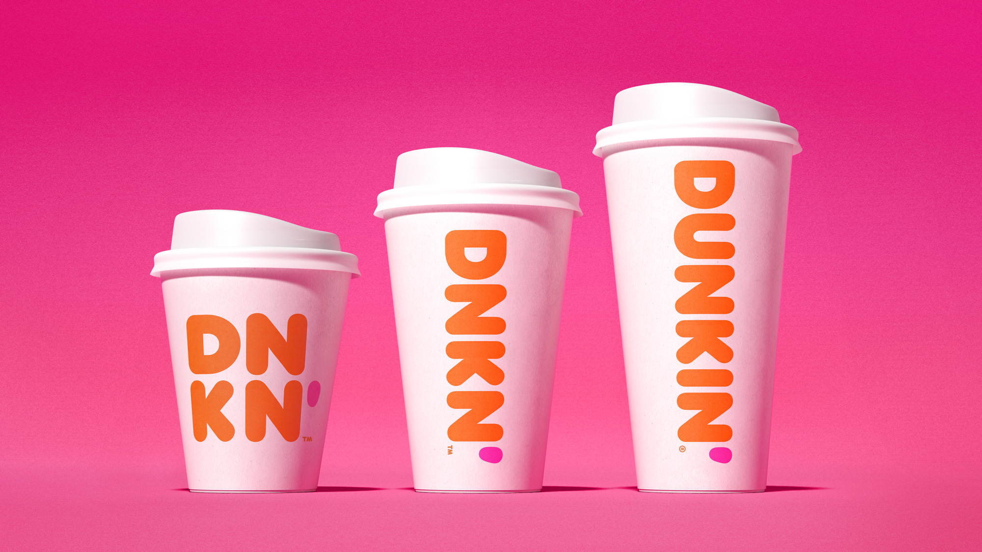
Dunkin'
In 2019, Dunkin' Donuts became Dunkin'. Dropping "Donuts" was a risky move for a company that had donuts in its name for nearly seventy years, but the strategy was sound. Dunkin' makes most of its money on drinks, so the old name was restrictive. They kept the rounded logo, and the orange and pink brand colours that you can spot at fifty paces, and of course the donuts didn't go anywhere either.
Key takeaway: a name change can protect brand equity if you keep the brand elements people already love.
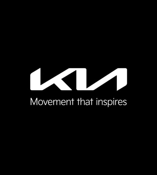
Kia
Kia's 2021 rebrand gave it a sleek new logo and slogan, with a strategic shift toward electric and premium. The new logo was such a change that the internet briefly couldn't read it, with thousands of people Googling "KN car", which could have been a marketing nightmare, but it got people talking about the brand. The drastic change showed a strong brand update targeting a modern audience.
Key takeaway: a new logo should signal a real strategic shift.
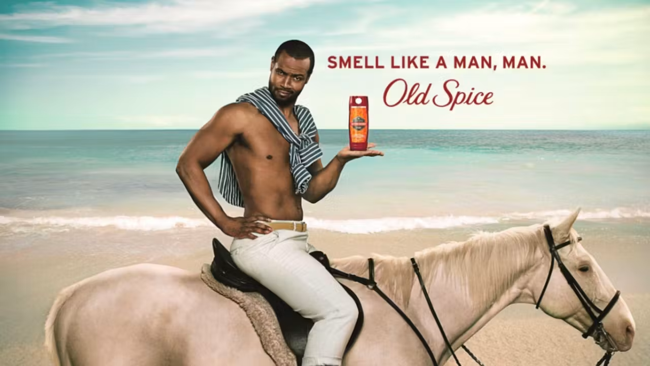
Old Spice
Old Spice is the great example of a rebrand that changed its reputation without touching its visual identity. In 2010 it went from your granddad's bathroom cabinet to one of the funniest brands on the internet, through tone, that campaign, and a flood of response videos. The product didn’t change but how people perceived it did, and the repositioning pulled in a younger audience without losing the loyal base.Key takeaway: if you have strong positioning, a rebrand doesn't always need a new logo.
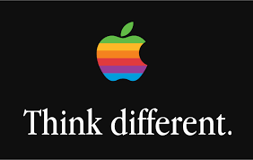
Apple
And the one that tops every list of the most successful rebrands: Apple. When Steve Jobs returned in 1997, he cut an oversaturated product line, refocused the company's identity around simplicity, and launched "Think Different". The rebrand created the values the company lives to this day.Key takeaway: the best rebrand is a strategic process the entire company commits to.Successful brands treat a major change to their identity as a strategic decision, followed by a new look. The ones that flip the order rarely make anyone's best examples list.
Rebrand launch ideas, the part most brands underthink
You’ve done the strategy, now the launch; the stage many rebrands don’t get past. Here’s what you need to consider:
Take your customers through the rebrand
If your customers wake up one day to a completely new everything, they might lose their minds. Drop hints, tease campaigns, share behind-the-scenes videos so your existing audience is part of the journey, and so they’re not shocked at the big reveal. The best rebranding announcement ideas and rebranding post ideas come from content that includes its audience.
Build FOMO
A countdown, a coordinated social media announcement so every channel hits on the same day, an email announcement to your list, a press release (if it's actually newsworthy). A launch event can work too, but remember it’s not about the canapés. Pull it together into one rebranding campaign rather than a scattering of posts.
Train your team
This sounds obvious but is overlooked. Your employees and stakeholders are the ones who will live the rebrand. They need clear, engaging guidelines and reasons to care as much as you do. If your own people can't explain the new positioning, your customers never will.
Rein-in the rebranding launch party
Yes, it’s the fun part, but overspending on a deck that gathers dust once the applause dies down is not a strategy. Your budget is better spent on the rollout, training, campaign, and the brand experience.
How to rebrand without losing the audience you've already got
The biggest fear with any rebrand is losing the already loyal customers. People often don’t like change, so it’s a valid concern, but the outcome depends on your positioning, and on whether you're changing your audience on purpose or by accident.
Take Jaguar; their 2024 rebrand split the marketing world. The loud colours, absence of cars in the launch film, and stripped heritage cues didn’t land with many. But Jaguar’s deliberate decision to change to upmarket and electric targeted a different buyer that got the vibe. It was a bold move, but you don’t get anywhere playing it safe.
We’re not saying copy, or avoid being Jaguar, but you need to decide which is more important; your existing audience or a completely new one. If you want to keep your loyal customers, protect the things they love, the parts of the brand story and brand experience that earned their customer loyalty, and change everything around them. If you're deliberately swapping audiences, accept the loss and commit.
The trap when you rebrand for women
The most common way to get this wrong is assumption-led branding. We call it femwashing, the rebranded cousin of pinkwashing. Women don’t want a softer colour palette and a cutesy tagline, especially when they’re often paying more for the same product advertised to men, but in pink. Like Monster's energy drink, FLRT, female-focused, in case regular Monster is just too masculine for us!
For decades, Victoria's Secret also got it wrong. They built their identity on a narrow, exclusionary idea of beauty that didn’t match what their customers wanted. What the brand said it stood for and what shoppers actually experienced misaligned, and customers took their money elsewhere. But here, the brand actually listened. It restructured its mission, brought in new spokespeople, built inclusive sizing and took accountability for its problems. Reinvention only feels real when it follows internal change rather than leading it. Customers can spot the difference from a mile off.
This also applies to examples beyond women's brands. Mastercard's True Name lets trans and non-binary customers use their chosen name on their card, resonating with the LGBTQIA+ community because it listened to them. The difference is involving the people you’re marketing to from day one. People in these communities will spot the lazy assumptions long before they reach a billboard. We get into this in our piece on why most brands still get women wrong, and it scales to every audience you'll target. Marketing to women: why most brands still get it wrong (and what actually works).
A rebrand that actually worked: Baby Central
When Baby Central came to us, they needed to level up to compete in a tough market. They had a solid presence, but the brand and website had stopped keeping pace with competitors. The digital experience lacked warmth, consistency and modern functionality, which made it harder to connect with their audience.
As always, we started with strategy. We ran workshops to understand the audience segments and the brand's ambition, then a refreshed brand identity and tone of voice rooted in empathy and trust. From there, a design system that flexes across four very different cultures while staying recognisably Baby Central. On the website, we focused on usability and warmth, from the structure right to the microcopy, so a tired parent could get what they needed, fast.
The result is a brand as thoughtful and adaptable as the people who use it. Clean and confident for partners, warm and welcoming for parents.
Key takeaways
If you skimmed, here are the rebranding ideas you need:
- Start with audience insight, market research and positioning. The logo comes last.
- Decide honestly whether you need a full rebrand, a partial rebrand, or just a brand refresh.
- Build creative direction sharp enough to slice through the robots.
- Borrow from the best examples.
- Plan the launch like it matters. Use teaser videos, real FOMO, a coordinated announcement, and a proper internal launch.
- Protect what your loyal customers love, or change your audience on purpose.
- Get lived experience into the room so the rebrand connects for real.
Thinking about a rebrand?
Great! Just please don’t come to us with a logo as your starting point.
At I Am Female* we build rebrands the right way round. Audience and positioning first, creative direction that cuts through, and launches that involve your customers. We've done it for brands like Baby Central (and many others) and we'd love to do it for you.
If you want a rebrand with the strategy to back it up, book a call with us today.


Go on… steal all of our brilliant ideas

Go on… steal all of our brilliant ideas
Fancy some emails you’ll actually want to read? Sign up for our newsletter and we’ll slide into your inbox with insights on how you can make your brand hotter than Dante's inferno.